Cracking the Code of Daily Fantasy Sports Players
After earning my Tableau certification, I challenged myself with a real-world sports data project. I focused on analyzing user behavior and building business intelligence tools to support retention strategy. The goal was to explore user engagement trends and translate those insights into actionable visuals.
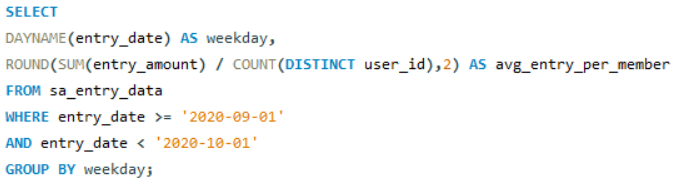
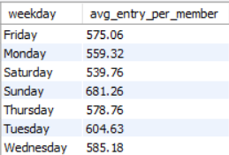
I started in SQL, using entry and signup data from September 2020. I wrote queries to calculate total entry volume from new users, broke down average entry amount per user by weekday, and identified the top five most-picked players by entry amount. I also developed a breakdown of how much each individual user contributed to a given player’s total entries, offering a unique perspective on player-user affinity and high dependency. Here are some examples of my SQL code and output:


Then I worked in Tableau, where I built three interactive dashboards tailored for a retention team. The first dashboard segments users based on contest type, time window, and activity, while tagging users as “Active” or “Inactive” using a recency rule. I also introduced a custom “Reactivation Potential” metric to help prioritize inactive users based on past value.
The second dashboard explores how user behavior varies with recency. I built a KPI toggle that lets users switch between metrics like Potential, Amount Played, and Entry Count, visualized against days since last entry in a scatter plot. The third dashboard is a dual-axis histogram and line graph showing total entry volume per user alongside the cumulative distribution; perfect for identifying engagement concentration across the user base. See the dashboards below:
This project helped me sharpen my skills in both data exploration and dashboard design, while applying business intelligence tools to the kind of user data I’m most passionate about: sports.